So the season may be winding down, but the marketing departments will soon be getting ramped up again. With that in mind, here are some ski area logos that I think are iconic. What I mean by that is that when you see them there is no question what they mean and you instantly get flashbacks of the place. Or, these logos are so classic and appropriate that you could not do any better. Anyways, here are some of my favorites:
1. Sugarloaf/USA

A marketing firm in Bangor created this simple, and now legendary logo, almost fifty years ago the year that they installed the Gondola. They wanted a simple logo that really captured the essence of the place. I don't think they could have done it any better. Any skier who sees this logo knows what it means. You see them on cars, signs, and even at other areas. Probably the best marketing logo out there. I just wish that the "USA" moniker returned.
2. Alta

Another classic logo that has endured. Like Sugarloaf, it captures the essence of Alta, and that is its snow. You see this on stickers, hats, shirts, and pretty much on a serious powderhound, who worships this logo. It also is quite patriotic thanks to the red/white/blue pattern. No modification needed.
3. Mad River Glen

Or of course:

I think that the circular logo is neat because it blends in the spruce bow with the snowflake and seems to blend in the "natural" feel of the place. But, of course, everyone knows of the infamous bumper stickers that was the invention of its former owner, Betsy Pratt, who wanted to convey the machismo of the place.
4. Sunday River

Or:

Or:
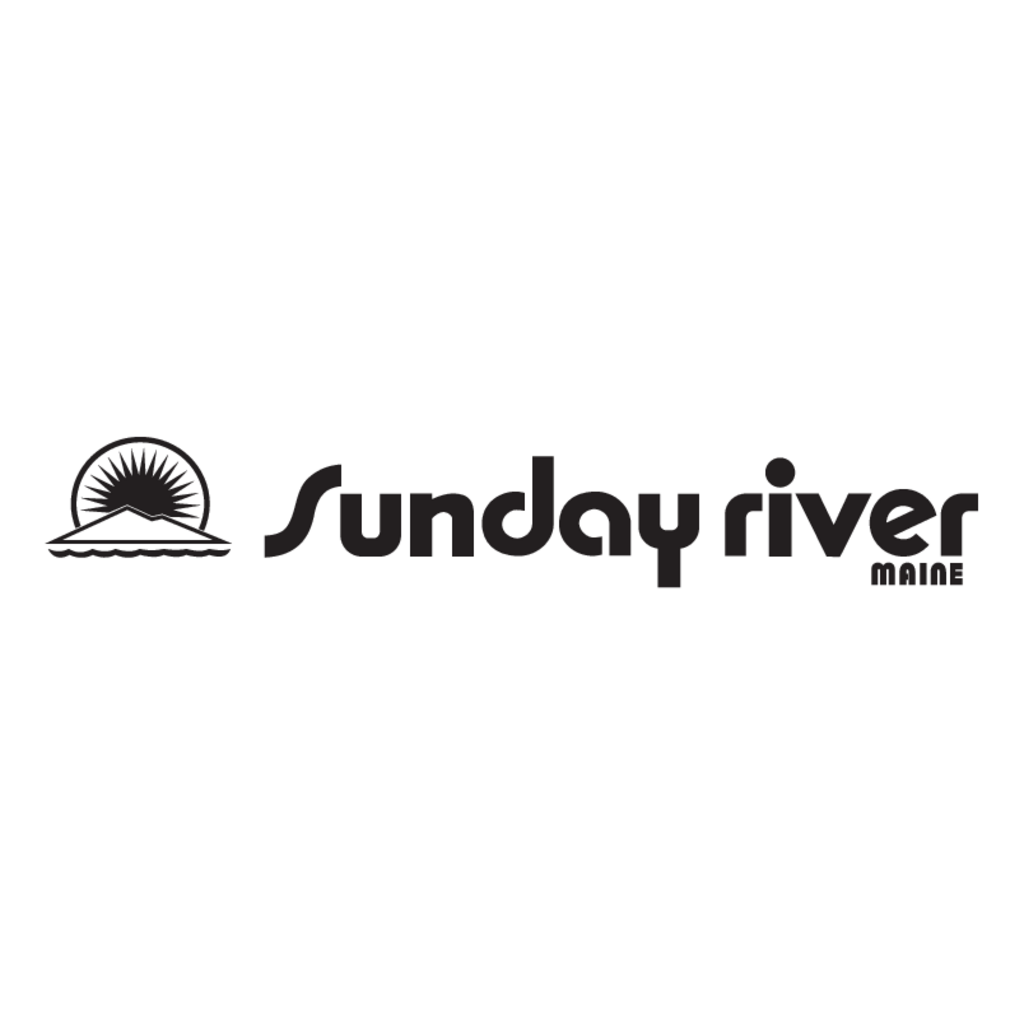
Those who skied in the 1980's and 1990's saw this logo in TV ads, on car bumpers, and in the market. The sun, in hindsight, seems to represent a new dawning on skiing and Les Otten's revolution of ski areas with fast lifts, lots of snowmaking, lots of grooming, and lots of hyperbole. I miss the old school script and the black diamond logo stickers.
5. Killington (this logo RIP)

Simple, big, and bold. Nothing really flashy because Pres and company didn't need to do anything more than simply state their name.
6. Sugarbush

The three-line mountain profile logo was developed by a Montpelier designer for the resort in the late 1980's and represents the profile of the segment of the mountain range that they occupy. Simple yet artsy. I also wish that they stuck with this bold font and their old slogan, "Where Great Skiers Ski."
And some others:
Steamboat
Like Killington, they do not have to do anything but state their name.
Brighton

Looks like a quilt or something. Really colorful and neat.
And Snowbird:

In 1971 they did not have dots for their "I's". This logo is neat because the wings represent the freedom one feels on its high slopes or flying through the powder. Also, the blue is appropriate for their winter season and green for summer. A simple but neat logo.
What are your favorites?
1. Sugarloaf/USA
A marketing firm in Bangor created this simple, and now legendary logo, almost fifty years ago the year that they installed the Gondola. They wanted a simple logo that really captured the essence of the place. I don't think they could have done it any better. Any skier who sees this logo knows what it means. You see them on cars, signs, and even at other areas. Probably the best marketing logo out there. I just wish that the "USA" moniker returned.
2. Alta
Another classic logo that has endured. Like Sugarloaf, it captures the essence of Alta, and that is its snow. You see this on stickers, hats, shirts, and pretty much on a serious powderhound, who worships this logo. It also is quite patriotic thanks to the red/white/blue pattern. No modification needed.
3. Mad River Glen
Or of course:
I think that the circular logo is neat because it blends in the spruce bow with the snowflake and seems to blend in the "natural" feel of the place. But, of course, everyone knows of the infamous bumper stickers that was the invention of its former owner, Betsy Pratt, who wanted to convey the machismo of the place.
4. Sunday River
Or:
Or:
Those who skied in the 1980's and 1990's saw this logo in TV ads, on car bumpers, and in the market. The sun, in hindsight, seems to represent a new dawning on skiing and Les Otten's revolution of ski areas with fast lifts, lots of snowmaking, lots of grooming, and lots of hyperbole. I miss the old school script and the black diamond logo stickers.
5. Killington (this logo RIP)
Simple, big, and bold. Nothing really flashy because Pres and company didn't need to do anything more than simply state their name.
6. Sugarbush
The three-line mountain profile logo was developed by a Montpelier designer for the resort in the late 1980's and represents the profile of the segment of the mountain range that they occupy. Simple yet artsy. I also wish that they stuck with this bold font and their old slogan, "Where Great Skiers Ski."
And some others:
Steamboat
Like Killington, they do not have to do anything but state their name.
Brighton
Looks like a quilt or something. Really colorful and neat.
And Snowbird:
In 1971 they did not have dots for their "I's". This logo is neat because the wings represent the freedom one feels on its high slopes or flying through the powder. Also, the blue is appropriate for their winter season and green for summer. A simple but neat logo.
What are your favorites?
